A note about candle sticks
Table of contents
The Candlestick Graphs
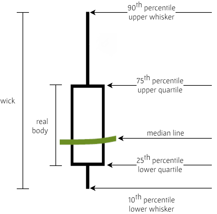
The Japanese candlestick graph is an excellent exploratory analysis tool for illustrating variation within a data set, and between data sets. If a median line curve is superimposed, the graph will also portray location (median) and symmetry/asymmetry (skewness) measures. Succinct.
A few years ago I started re-purposing HighCharts' Candlestick graphs for data types other than stocks. The core difference between a re-purposed graph, and an original, is what a candlestick wick represents. In the case stock candlesticks, the ends of a wick denote the highest and lowest stock prices w.r.t. (with respect to) a time interval in question, whereas the wick ends of a re-purposed candlestick denote the 25th & 75th percentiles; as illustrated below, but also w.r.t. a time interval in question. The candlestick graphs within any greyhypotheses organisation are annotated as illustrated below.